Tagged: mobile website
- This topic has 0 replies, 1 voice, and was last updated 9 years, 10 months ago by
 Administrator.
-
AuthorPosts
-
-
February 2, 2015 at 4:20 pm #3222
 AdministratorKeymaster
Google sends warnings to mobile-unfriendly sites
Get a mobile plan today — leave your competition behind tomorrow!
Last week, Google sent tons of warnings to websites that have “critical mobile usability errors”.
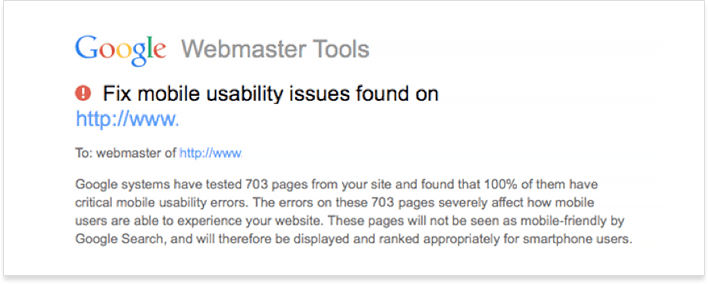
Although these were just warnings and they don’t mean a penalty, it may be high time to refresh your knowledge of what makes for a mobile-friendly site and get a mobile plan before Google gets more serious about it (before it adds more weight to the mobile-friendliness ranking factor).
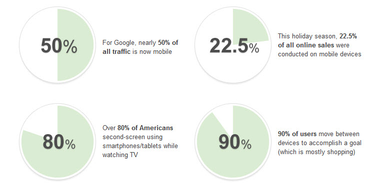
Why is mobile so important to Google?
Over the recent years, it has become obvious that the multi-screen Web will be the future (that is, the average Internet surfer will use several devices to complete a goal).
Is mobile-friendliness affecting Google ranking yet?
No doubt, Google is deeply invested in motivating webmasters to step up their mobile optimization efforts.
- Google now labels mobile-optimized sites “mobile-friendly” in mobile SERPs
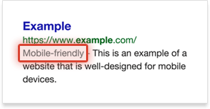
- “Mobile-friendly” sites get a slight ranking boost (Google is believed to be testing this now)
- Google said they were ready to downgrade sites misconfigured for smartphones
So, why wait? With all these signals coming straight from Google, it’s best to get a mobile strategy now — and stay ahead of the curve in the future!
5 Steps to making your site mobile-friendly
- Learn where you stand in terms of mobile
- Choose your mobile solution (if you don’t have one yet)
- Adhere to mobile optimization best practices
- Avoid these mobile design mistakes
- Use these tools to improve your mobile rank
Here are the steps to take to ensure your site is free of serious mobile issues and that you have a clear strategy to execute long-term.
1. Learn where you stand in terms of mobile
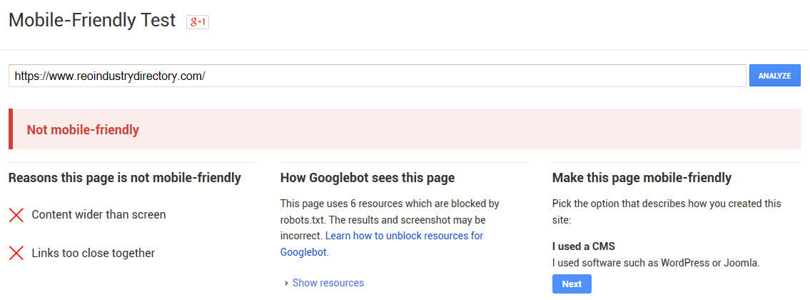
Test your site using Google’s Mobile-Friendly Test. There, you may get one of the following 2 results:
– Your site is mobile-friendly
Which means that you probably have a mobile plan already and have nothing to worry about.
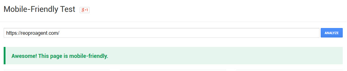
– Your site fails the mobile-friendliness test
Quite often, the reasons for this are:
- Text too small to read
- Links too close together
- Mobile viewport not set
By default, smartphone browsers lay out a page as if you were viewing it on a desktop monitor. This way you end up with the scaled-down version of a page that’s hard to read without zooming in. In order to get the browser to render your page at a more readable scale, you need to use the viewport meta element:
<meta name=”viewport” content=”width=device-width, initial-scale=1″>
More information on this can be found here.
So, if your site fails to pass Google’s mobile-friendly test, move on to the next step.
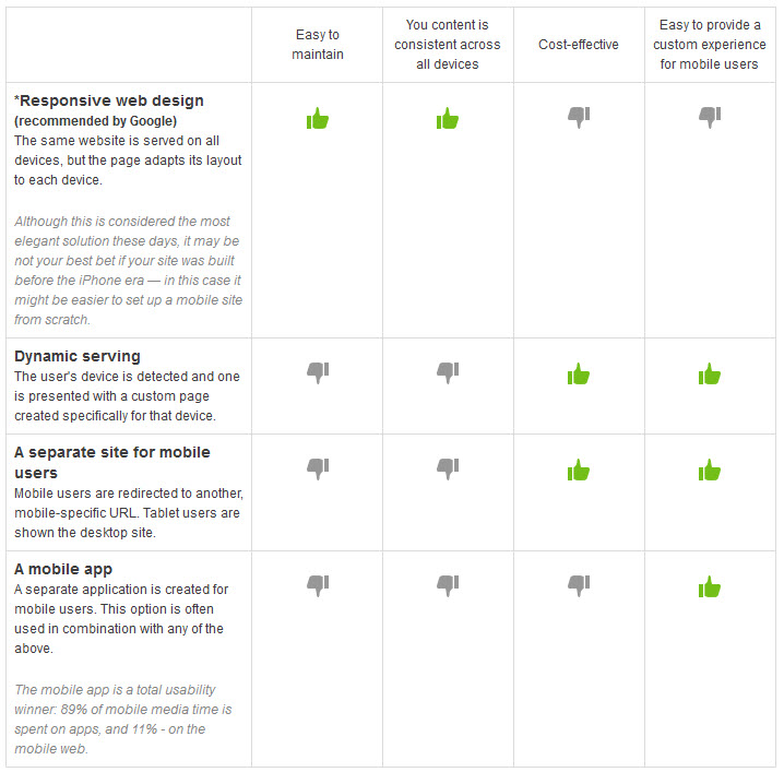
2. Choose your mobile solution (if you don’t have one yet)
When you decide on a long-term mobile plan, there are several options you get.
3. Adhere to mobile optimization best practices
Remember the “mobile-friendly” label that appears in mobile SERPs? For your website to be eligible for it, it has to meet the following criteria (as detected by Googlebot):
Your site avoids software not common on mobile, like Flash
The majority of mobile browsers do not render content that uses Flash. Here’s what you could use instead.
You use text that’s readable without zooming
First, configure a viewport to make sure fonts are scaled as expected across various devices. Once you’ve done that, implement the additional recommendations regarding fonts on this page.
Your page sizes content to the screen so users don’t have to scroll horizontally
Create content that flows in the viewpoint so that your visitors don’t have to scroll horizontally to see the entire content. You can do this by sizing content to viewpoint.
You place links far enough apart to aid tapping
Avoid cramming too many touch elements into one page segment or making them too small. Google recommends a minimum tap target size of roughly 7mm, or 48 CSS pixels on a site with a properly-set mobile viewport.
[kleo_icon icon="thumbs-up" icon_size="medium"] [/kleo_icon] For those using WordPress, Joomla, etc.
If you use an out-of-the-box CMS on your site (as opposed to hand-coding it from scratch), here are some mobile optimization recommendations for sites that run on WordPress, Joomla, Drupal, Blogger, vBulletin, Tumblr, DataLife Engine, Magento, Prestashop, Bitrix and Google Sites.
4. Avoid these mobile design mistakes
Once you’ve chosen the solution that best suits your goals and budget, here are some common mobile optimization mistakes to avoid.
- Do not block JavaScript, CSS or image files
Google has long advised SEOs against blocking these asserts (let’s say, in robots.txt), as this may result in poorer rankings for your mobile as well as your desktop site. To make sure these are not blocked, perform the Fetch as Google test in Google Webmaster Tools. Learn more
- Avoid putting up unplayable content
Mobile browsers may have problem with license-restricted content or content that requires Flash or an uncommon player to be installed. It’s best to avoid these to improve mobile user experience. Learn more
- Set up your redirects properly
In regards to mobile, faulty redirects are any redirects that point the mobile user to the wrong equivalent of the “desktop” URL. Usually these issues would be reported in Google Webmaster Tools. Learn more
- Watch out for mobile-only 404s
Sometimes a page that loads perfectly fine on desktop returns a 404 on mobile. The best practices is to ensure the respective mobile page is not a 404 and to always redirect mobile users to mobile equivalents of your desktop pages. Learn more
- Don’t push users to download your app aggressively
If you have an app you’d like to advertise to mobile users, this should not be done in such a way that it prevents users from browsing your content unless they download the app. This can cause indexing issues and cause users to have a poor experience on your site. Learn more
- Check for irrelevant cross-links
If you use a separate mobile site, check its internal links for consistency. Make sure those internal links go to mobile-optimized pages, not to their desktop counterparts (such as your desktop-optimized homepage, for example). Learn more
- Make sure your page isn’t too slow
Speed is a crucial factor on mobile (in part because mobile browsers can’t handle bulky pages as effortlessly as desktop browsers). Hence, test the speed of your site for mobile users and improve on it, if necessary. Learn more
5. Use these tools to improve your mobile rank
So, even if your site is mobile-friendly and meets Google criteria, does it mean it will automatically get top ranking in mobile search engine? Well, nope. You’d still need to optimize your mobile website/application to promote it in mobile search or in an app store.
Mobile SEO basics
In addition to covering the mobile web design basics mentioned above, pay attention to the purely SEO-pertaining optimization aspect.
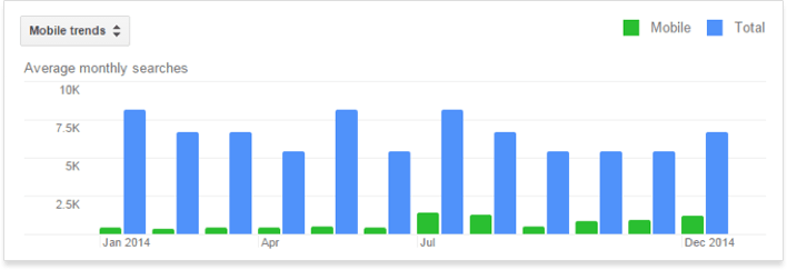
- Mobile-focused keyword research
Perhaps you should use slightly different keywords for your mobile site/app than you use for your desktop site? Head to Google’s Keyword Planner and choose the Mobile trends view to find out:
- Add mobile URLs to your Sitemap
In order to indicate that some of your URLs serve mobile web content, particular syntax should be used. Please note that URLs serving multiple markup languages can be listed in a single Sitemap. After you add your mobile content, submit your Sitemap to Google as usual.
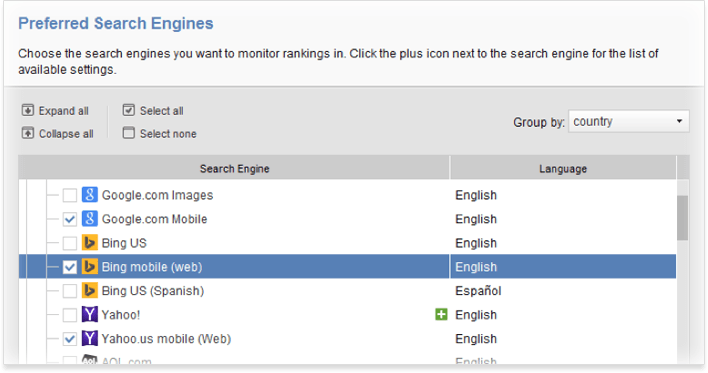
- Track organic rankings in mobile SERPs
Did you know Rank Tracker could track organic rankings of your site in major mobile search engines? Because the majority of mobile search activity occurs on Google anyway (yes, even on the iOS), this is often more than enough to get an idea of your site’s standing in organic mobile SERPs:
ASO (app store optimization) basics
Because 63% of app downloads come through app store search, it’s also a great idea to optimize for higher positions in either Google Play (Android) or Apple’s iTunes (iOS) app store.
- App store optimization ranking factors
– Keywords in app title (here’s a nice tool that pulls App Store keyword suggestions from the autocomplete)
– Keywords in app description
– Using a nice icon (to increase downloads, which will help ASO)
– Use the correct type and category
– Strive for higher ratings and better reviews
– Try to get more downloads
– Pro tip (HT to John Rampton): use a Google+ plugins on your app page, since +1’s help your rank in Google Play.
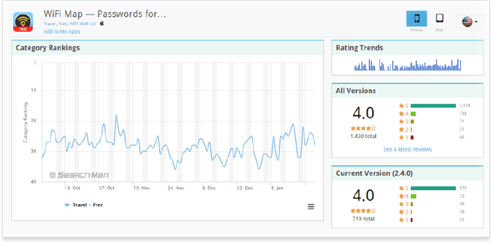
- App store rank trackers
Here are some tools you can use to check where your app ranks among Android or iOS apps.
Over to you
So, are you ready for some serious mobile optimization work? Or perhaps your website is already perfectly optimized for mobile and works like a clock? Please, share your insight and experiences in the comment section below!
-
-
AuthorPosts
- You must be logged in to reply to this topic.